What is Color Therory?
Color theory is a collection of rules and guidelines that ui/ux designers follow in order to find right color for their web/product design. In school you might have heard about colors and how we can create more colors by mixing different colors.
For example,
- Red + Yellow = Orange color
- Blue + Yellow = Green color
- Red + Blue = Purple color
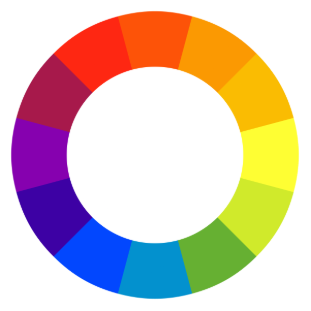
When you mix orange, green and purple with red, yellow and blue again you will get different colors. More and more colors are created by mixing different colors. Finally, we get color wheel which is made of different mixed colors.
What is Hue, Saturation and Value?
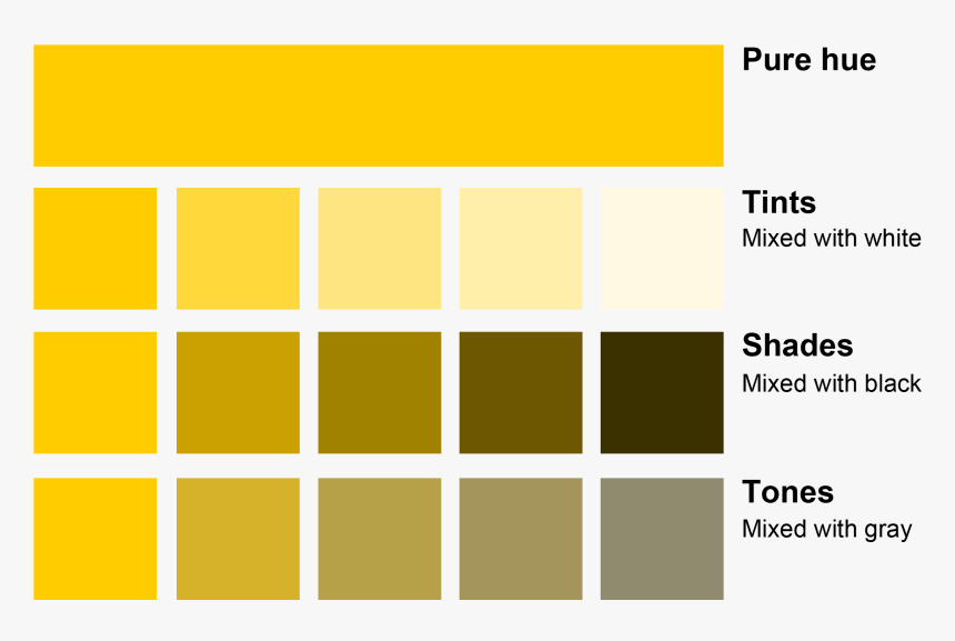
Hue, Saturation and Value might be a new term for you but they are key terms to understand how colors are formed. Hue is a different name for actual color or primary color.
You can call Hue as pure color without white, black or gray color is added. When white color is added to hue it becomes tint, when black is added to hue it becomes shade and when gray is added to hue it becomes tone.
There are three main colors in a light: Red, Green and Blue i.e. RGB. You can call these colors as primary colors. When you mix primary colors together it becomes secondary colors.
- Red + Blue = Magenta
- Red + Green = Yellow
- Green + Blue = Cyan
When you mix primary + secondary colors they become tertiary colors.
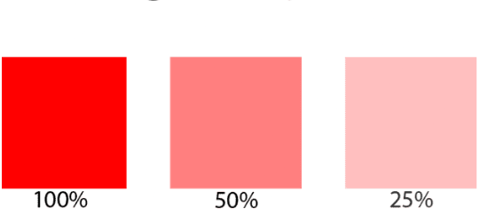
Saturation refers to intensity of hue in a color. When we increase saturation color becomes more pure i.e. hue and when we decrease saturation the color appear to be more washed-out or pale. Saturation is defined as a percentage that ranges from 0% (grayscale) to pure color (100%).
Primary colors red, blue and yellow are considered truest version color as they are fully saturated. Color saturation determines how certain hue will look in certain lighting conditions. For example, a wall painted with a solid color will look different during the day than it does at night.
Because of the light, the saturation of the wall will change over the course of day, although it is still the same color. When the saturation is zero, what you will see is a shade of gray.
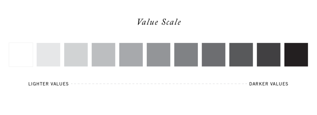
Value (lightness) describes overall intensity to how light or dark a color is. It defines a color in terms of how close it is to white or black. When value is low it means the color can emit less light and when value is high that means it can emit more light from the color.
How to create color palette or scheme?
Now that we know about Hue, Saturation and Value how do we make use of these and create a color palette? In color theory, color harmony refers to pleasing and harmonious color combinations based on the color wheel.
You can create harmonious color schemes or palette by adjusting saturation and brightness as needed on top of the color wheel. Nowadays, artists and designers use rules of color combinations to find color harmonies on the color wheel.
Different types of color harmonies:
- Complementary
- Split-Complementary
- Analogous
- Triadic
- Tetradic
- Square
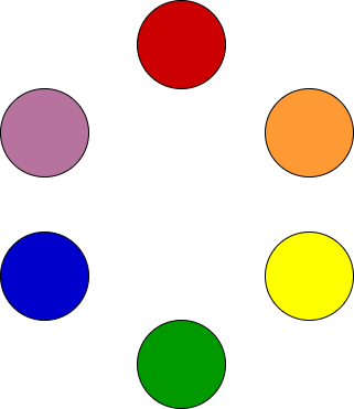
- Monochromatic
You can learn more about these in the next tutorial. Hope you find this tutorial very useful please share and like.
Learn more about color guides by reading following awesome article: